
The idea of building machine learning models or artificial intelligence or deep learning models works on a constructive feedback principle. The model is built, get feedback from metrics, make improvements, and continue until the desirable classification accuracy is achieved. Evaluation metrics explain the performance of the model.
What are evaluation metrics?
Evaluation metrics are quantitative measures used to assess the performance and effectiveness of a statistical or machine learning model. These metrics provide insights into how well the model is performing and help in comparing different models or algorithms.
When evaluating a machine learning model, it is crucial to assess its predictive ability, generalization capability, and overall quality. Evaluation metrics provide objective criteria to measure these aspects. The choice of evaluation metrics depends on the specific problem domain, the type of data, and the desired outcome.
Types of predictive models
When we talk about predictive models, it is either about a regression model (continuous output) or a classification model (nominal or binary output). The evaluation metrics used in each of these models are different.
In classification problems, we use two types of algorithms (dependent on the kind of output it creates):
- Class output: Algorithms like SVM and KNN create a class output. For instance, in a binary classification problem, the outputs will be either 0 or 1. However, today we have algorithms that can convert these class outputs to probability. But these algorithms are not well accepted by the statistics community.
- Probability output: Algorithms like Logistic Regression, Random Forest, Gradient Boosting, Adaboost, etc., give probability outputs. Converting probability outputs to class output is just a matter of creating a threshold probability.
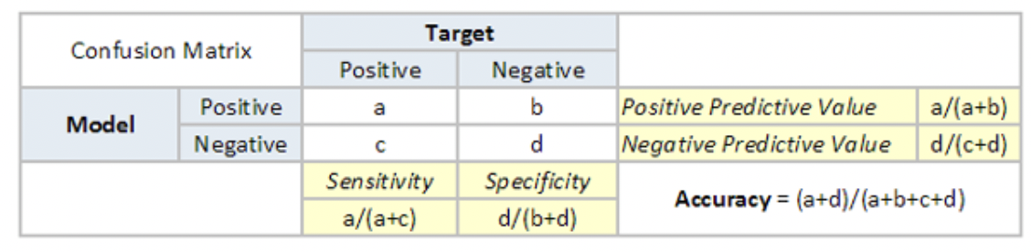
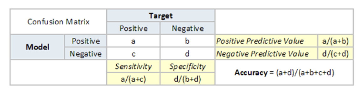
Confusion matrix
A confusion matrix is an N X N matrix, where N is the number of predicted classes. For the problem in hand, we have N=2, and hence we get a 2 X 2 matrix. It is a performance measurement for machine learning classification problems where the output can be two or more classes.
Confusion matrix is a table with four different combinations of predicted and actual values. It is extremely useful for measuring precision-recall, Specificity, Accuracy, and most importantly, AUC-ROC curves.
Here are a few definitions you need to remember for a confusion matrix:
- True Positive: You predicted positive, and it is true.
- True Negative: You predicted negative, and it is true.
- False Positive: (Type 1 Error): You predicted positive, and it is false.
- False Negative: (Type 2 Error): You predicted negative, and it is false.
- Accuracy: the proportion of the total number of correct predictions that were correct.
- Positive Predictive Value or Precision: the proportion of positive cases that were correctly identified.
- Negative Predictive Value: the proportion of negative cases that were correctly identified.
- Sensitivity or Recall: the proportion of actual positive cases which are correctly identified.
- Specificity: the proportion of actual negative cases which are correctly identified.
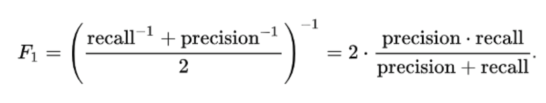
F1 Score
F1-Score is the harmonic mean of precision and recall values for a classification problem. The formula for F1-Score is as follows:
Gain and Lift Charts
Gain and Lift charts are concerned with checking the rank ordering of the probabilities. Here are the steps to build a Lift/Gain chart:
- Step 1: Calculate the probability for each observation.
- Step 2: Rank these probabilities in decreasing order.
- Step 3: Build deciles with each group having almost 10% of the observations.
- Step 4: Calculate the response rate at each decile for Good (Responders), Bad (Non-responders), and total.
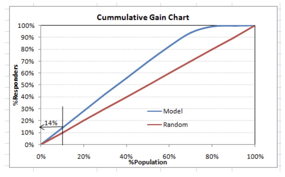
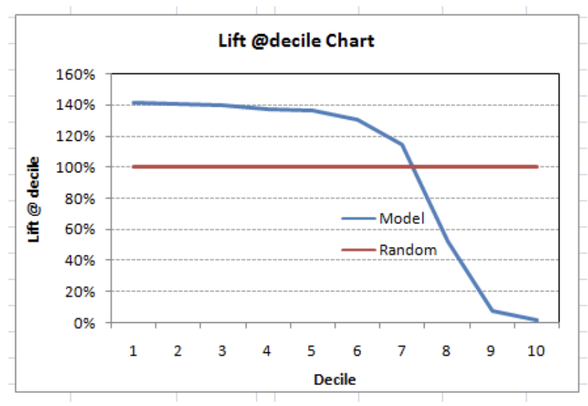
This graph tells you how well your model segregating responders from non-responders is. For example, the first decile, however, has 10% of the population, has 14% of the responders. This means we have a 140% lift at the first decile.
The lift curve is the plot between total lift and %population. Note that for a random model, this always stays flat at 100%. Here is the plot for the case in hand:
You can also plot decile-wise lift with decile number:
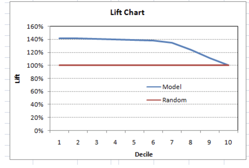
What does this graph tell you? It tells you that our model does well till the seventh decile. Post which every decile will be skewed towards non-responders.
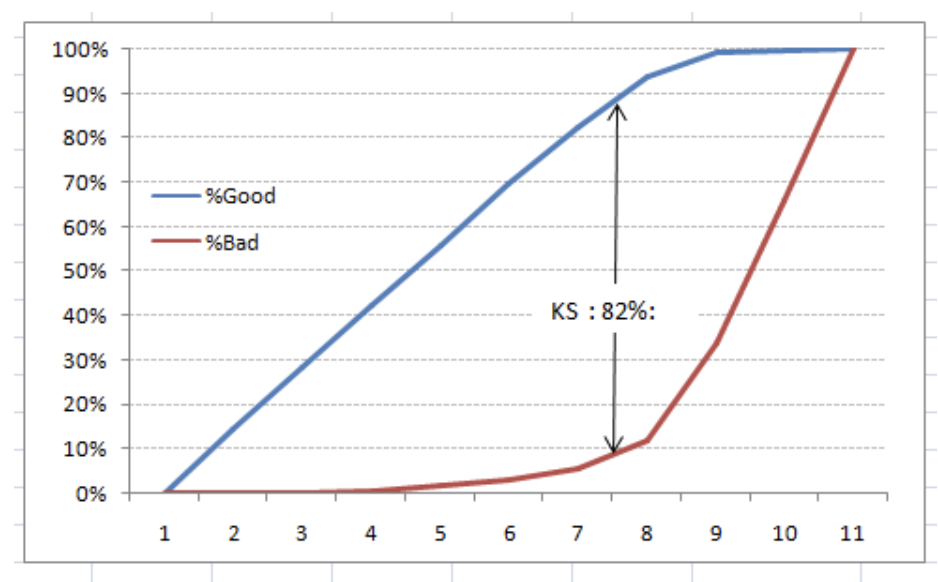
Kolomogorov Smirnov chart
K-S or Kolmogorov-Smirnov chart measures the performance of classification models. More accurately, K-S is a measure of the degree of separation between the positive and negative distributions. The K-S is one hundred if the scores partition the population into two separate groups in which one group contains all the positives and the other all the negatives.
The evaluation metrics covered here are mostly used in classification problems. So far, we have learned about the confusion matrix, lift and gain chart, and Kolmogorov Smirnov chart. Let us proceed and learn a few more important metrics.
Area under the ROC curve (AUC – ROC)
This is again one of the popular evaluation metrics used in the industry. The biggest advantage of using the ROC curve is that it is independent of the change in the proportion of responders. This statement will get clearer in the following sections.
Let us first try to understand what the ROC (Receiver operating characteristic) curve is. If we look at the confusion matrix below, we observe that for a probabilistic model, we get different values for each metric.
Hence, for each sensitivity, we get a different specificity. The two vary as follows:
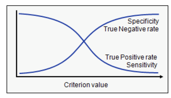
The ROC curve is the plot between sensitivity and (1- specificity). (1- specificity) is also known as the false positive rate, and sensitivity is also known as the True Positive rate. The following is the ROC curve for the case in hand.
Log loss
AUC ROC considers the predicted probabilities for determining our model’s performance. However, there is an issue with AUC ROC, it only considers the order of probabilities, and hence it does not consider the model’s capability to predict a higher probability for samples more likely to be positive. In that case, we could use the log loss, which is nothing but a negative average of the log of corrected predicted probabilities for each instance.
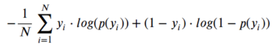
- p(yi) is the predicted probability of a positive class.
- 1-p(yi) is the predicted probability of a negative class
- yi = 1 for the positive class and 0 for the negative class (actual values)
Gini coefficient
The Gini coefficient is sometimes used in classification problems. The Gini coefficient can be derived straight away from the AUC ROC number. Gini is the ratio between the area between the ROC curve and the diagonal line & the area of the above triangle. Following are the formulae used:
Gini = 2*AUC – 1
Root Mean Squared Error (RMSE)
RMSE is the most popular evaluation metric used in regression problems. It follows an assumption that errors are unbiased and follow a normal distribution. Here are the key points to consider on RMSE:
- The power of ‘square root’ empowers this metric to show considerable number deviations.
- The ‘squared’ nature of this metric helps to deliver more robust results, which prevent canceling the positive and negative error values.
- It avoids the use of absolute error values, which is highly undesirable in mathematical calculations.
- When we have more samples, reconstructing the error distribution using RMSE is more dependable.
- RMSE is highly affected by outlier values. Hence, make sure you have removed outliers from your data set prior to using this metric.
- As compared to mean absolute error, RMSE gives higher weightage and punishes large errors.
RMSE metric is given by:
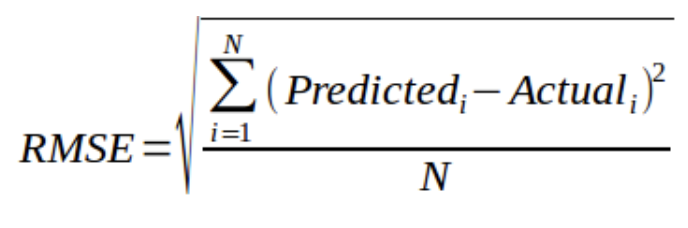
where N is the Total Number of Observations.
Root Mean Squared Logarithmic Error
In the case of Root mean squared logarithmic error, we take the log of the predictions and actual values. So, what changes are the variance that we are measuring? RMSLE is usually used when we do not want to penalize huge differences in the predicted and the actual values when both predicted, and true values are vast numbers.
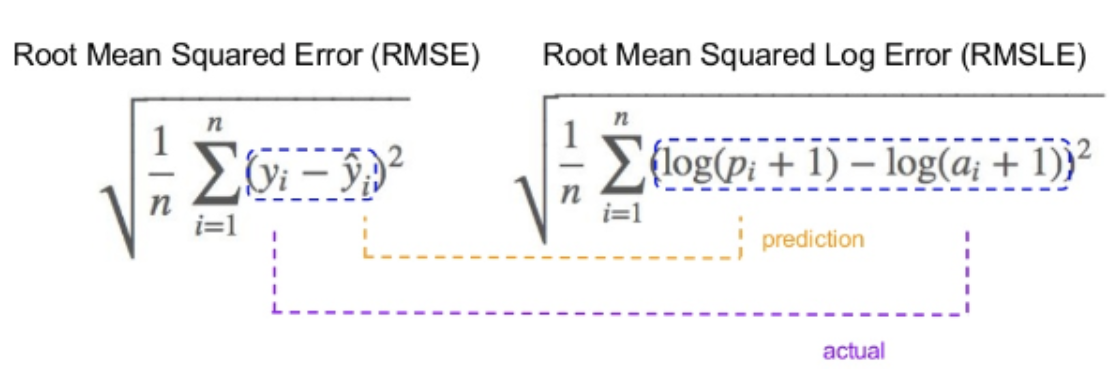
- If both predicted and actual values are small: RMSE and RMSLE are the same.
- If either predicted or the actual value is big: RMSE > RMSLE.
- If both predicted and actual values are big: RMSE > RMSLE (RMSLE becomes almost negligible)
R-Squared/Adjusted R-Squared
We learned that when the RMSE decreases, the model’s performance will improve. But these values alone are not intuitive.
In the case of a classification problem, if the model has an accuracy of 0.8, we could gauge how good our model is against a random model, which has an accuracy of 0.5. So, the random model can be treated as a benchmark. But when we talk about the RMSE metrics, we do not have a benchmark to compare.
This is where we can use the R-Squared metric. The formula for R-Squared is as follows:
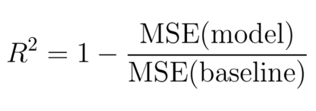
MSE(model): Mean Squared Error of the predictions against the actual values.
MSE(baseline): Mean Squared Error of mean prediction against the actual values.
Let us now understand cross-validation in detail.
The concept of cross-validation
Cross-validation is one of the most important concepts in any type of data modeling. It simply says, try to leave a sample on which you do not train the model and evaluate the model on this sample before finalizing the model.
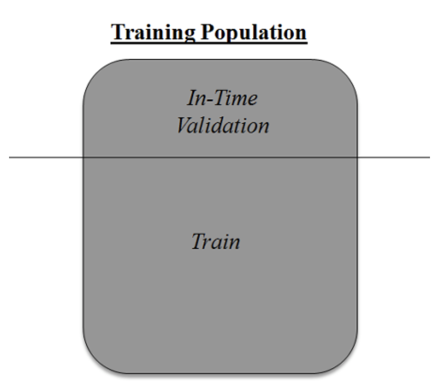
The above diagram shows how to validate the model with the in-time sample. We simply divide the population into two samples and build a model on one sample. The rest of the population is used for in-time validation.
Could there be a disadvantage to the above approach?
A negative side of this approach is that we lose a good amount of data from training the model. Hence, the model is extremely highly biased. And this will not give the best estimate for the coefficients. So, what is the next best option?
K-Fold cross-validation
Let us extrapolate the last example to k-fold from 2-fold cross-validation.
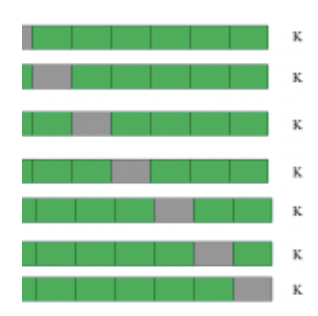
This is a 7-fold cross-validation.
The entire population is divided into seven equal samples. Now we train models on six samples (Green boxes) and validate on one sample (grey box). Then, at the second iteration, we train the model with a different sample held as validation. In seven iterations, we have built a model on each sample and held each of them as validation. This is a way to reduce the selection bias and reduce the variance in prediction power. Once we have all seven models, we take an average of the error terms to find which of the models is best.
How does this help to find the best (non-over-fit) model?
k-fold cross-validation is widely used to check whether a model is an overfit or not. If the performance metrics at each of the k times, modeling are close to each other and the mean of the metric is highest.
Access hundreds of hours of expert presentations OnDemand by signing up for our membership:
 Nasi Rwigema
for


AI accelerator insider insider
Thank you for subscribing
Level up your ai accelerator insider career & network with ai accelerator insider experts.
An email has been successfully sent to confirm your subscription.
 Follow us on LinkedIn

